Monthly Archives: March 2020

Øystein Sture Aspelund – Photography

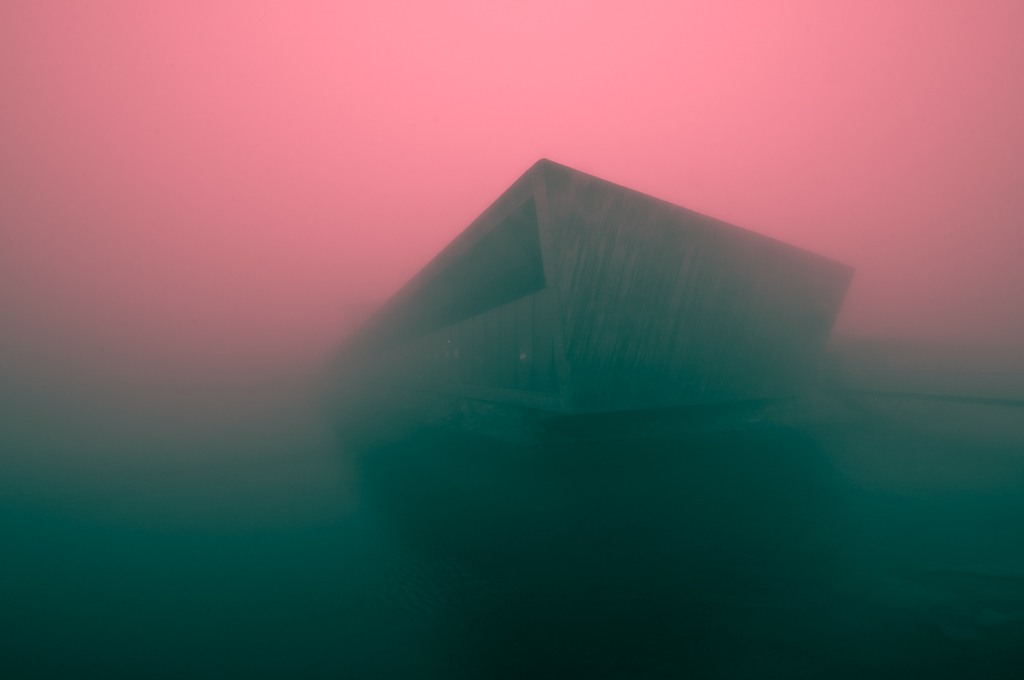
Øystein Aspelund is a photographer based in Trondheim, Norway. We love the way he adds narrative and story into his images, creating strange landscapes and a really moody feel.

We’re sharing some images from his series called Aftermath, which we love.

You can see more of his work on his Behance page here.

Or you can visit his website here.

Augarten Wien – Campaign

Porcelain figurines are perhaps not the hottest item on the market right now. This was the problem facing Augarten Wien, a well-respected porcelain company in Vienna who have been making porcelain for hundreds of years. They turned to Jung von Matt to help with this, and in a masterstroke, the agency went with memes as a way to make these figurines relative again.

In terms of understanding culture and how to help your brand be a part of it, we’re sure that it doesn’t get much better than this! Who thought porcelain figurines could be so cool!

Otrivin – Print Campaign

This campaign by Wunderman in Dubai was an easy pick to share on the blog. We love a lot about this work but we wanted to highlight not only the way the creatives took a difficult product benefit and made it easily understandable but also the representation of a woman in a hijab. It’s important that people see representations of themselves and their cultures in advertising and this certainly ticks that box.

The use of illustration here adds a lot of fun and interest to the work and we must say – really helps you to understand how long a pill can take to work, compared to a nose spray. That’s exactly how you take something many people would consider ‘boring’ and make it exciting and appealing through creativity. Perfect!

Greece National Postal Museum – Print Campaign

This is such an engaging campaign by Greek advertising agency Three Squares for the National Postal Museum. Using some imaginative illustration they were able to add some drama and narrative to stamps and the sending of post. What a great way to breathe new life into something most of us probably take for granted.

You can see more of the campaign below.

The Witcher – Map of the Continent

If you’re a fan of the Witcher and have maybe read the books, played the games or watched the series on Netflix, you’ll know that story lines and time lines can get a little bit complicated. That’s where this interactive map comes in. It uses a timeline as a navigation tool, which then shows the user where certain events happened on the map. This helps you get a better idea of how much time has passed in the show and then also where things are in relation to each other geographically.

In terms of information design and how to take complicated narrative threads and make them navigable and understandable, you’ll have to look really hard to find something better than this!

You can visit the site here.

Jeans for Refugees – Website

This initiative by artist Johny Dar takes old jeans owned by famous people, then reimagines them and sells them off to donate money to good causes. We love it!

It helps also that the website is really fun to use and look at. We especially enjoy how the pieces of fabric and thread come together in the type – very nice!

You can visit the site here.

Parsons Branding – Website

Parsons Branding is a Cape Town based branding and design agency with some really lovely work. Today we’re sharing not just their website (which is amazing) but also their work too. We love the way the scrolling works on the website, which you’ll need to visit to see of course, but we also love their work. We included some examples of their identity and packaging work for a beer brand in the UK called Wolfpack which you can see below.

You can visit their website here to see more of their amazing work. And look out for that scroll effect!

Rapscallion Soda – Packaging

Rapscallion Soda is a Scottish soda company with a hands-on, craft approach. To launch their product in the market, they turned to Freytag Anderson for their design, which we think is out of this world.

This modern, minimalist take on packaging (especially for the soda category) is such a breath of fresh air. How could this not create a huge impact the very second you see it on shelf, or in someone’s hand?

Amazing!

Stellenbosch Academy student featured on Lürzer’s Archive

Wow! We are so unbelievably proud!

We’ve just received news that Jamie Slabber, an art direction student who graduated in 2019, has been featured in Lürzer’s Archive 2020. What an incredible achievement.

We’ve included his featured work here for CALM, which aims to help men deal with mental health issues – a very worthy cause.

Added to this, the Academy also received an official ranking from Lürzer’s, which you can view here. It is always special to be recognised on the international stage and we must thank all of our staff and students for their hard work – it really does pay off!

You can view Jamie’s work on the Lürzer’s site here.

Well done to all involved!