Monthly Archives: April 2019

Dogstudio – Website

We love this website for Dogstudio, a creative agency that describes themselves as a ‘multidisciplinary creative studio at the intersection of art, design and technology.’

With a 3D animated dog that changes colour and moves as you navigate through the site and a really unique tone in their copy – this is as good as web design gets right now!

We do suggest you take a visit to the site and spend some time looking around. You can do that here.

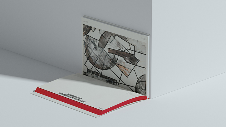
Svyat Vishnyakov – AZ Museum Branding

There’s something very exciting about getting a brief to design (or redesign) the identity of a museum. Often, it allows for more avant-garde and interesting design choices, where designers can be a little more expressive and risk-taking, compared to their ‘every day’ clients.

This identity by Svyat Vishnyakov is just that type of work. He was tasked to redesign the identity for the AZ Museum in Moscow. The AZ Museum is a private museum that houses the works of Anatoly Zverev, a prominent figure of the Russian expressionism movement from the 1960s. You can see how he used the artist’s initials, AZ, as a starting point, then expanded his thinking further and further throughout the project. From business cards to clothing that people can buy in the museum shop – this identity covers it all!

We absolutely love it!

Book Dash 2019

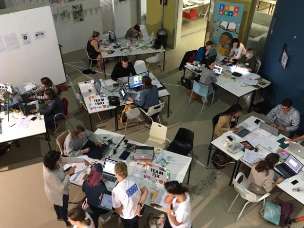
On 13 April we hosted Book Dash 2019. Book Dash is an annual event where creative people combine their powers to create children’s books in a 12 hour sprint. All of the time people give to the project is volunteered, meaning that all of value goes towards the kids. To date, Book Dash has published 117 books and distributed over 400 000 copies to children across the country.

This year the challenge was to create books for babies aged 0 – 2 years old. No mean feat! Seeing the incredible creativity and drive of everyone involved made for such an incredible day, and an incredible outcome. What a special thing to be a part of!

To learn more about Book Dash, you can visit their website here.

Open Day – 11 May 2019

It’s that special time again! Our next Open Day will be held on 11 May 2019 at the Stellenbosch Academy.

We’d love to show you around our space and let you see the incredible work being created by our students.

Talks will be held at 10:30 and 12:00.

If you’re interested in attending please RSVP here. We’d love to see you there!

Entourage – Print Campaign

This simple and hard-hitting campaign by TBWA Paris for Entourage, a French NGO, shows just how dangerous homelessness can be. With a smart use of photography and camera angles, it shows homeless people on the verge of falling into a cityscape, along with the copy line: Give a helping hand with our app.

Print advertising at its best!

Pornhub – BeeSexual

Pornhub as a brand has never been shy to advertise and get itself out there. This new campaign they’ve created to save the bees is no different! To help save the bees, they created an entire section of their website dedicated to films of bees. For every film that gets watched, Pornhub will donate to charities that will help save the bees.

This video they created does such a good of explaining their thinking and how the project will work. Have a watch below. And don’t worry – it’s all Safe For Work!

Nutrinovate – Packaging

Packaging for a new product is always an interesting problem to solve. And when that new product is an entirely new type of product, it becomes especially interesting. That’s exactly the thing that Pond Design had to deal with when they were tasked to create the new packaging for Nutrinovate.

Nutrinovate is a new type of delivery system for vitamins and supplements, using a thin film. These films, created from algae, can be placed inside your cheek or under your tongue and allow your body to absorb the vitamins through your mucus membranes, instead of your digestive system.

We love how they’ve taken some of the cues from traditional vitamin and supplement design and created something new, modern and most importantly: Believable. Buying into something new like this is never easy, and having packaging that adds to credibility is vitally important.

Job well done!

Jack Daniels Tennessee Fire – Packaging

We love this packaging for Jack Daniels Tennessee Fire, created by Higgins Design in Germany. It uses real firehose material to package the bottle! This is such a smart way of using interesting substrates in your packaging, while still being entirely conceptual.

As Marshall McLuhan said: The medium is the message!

National Geographic – Print Campaign

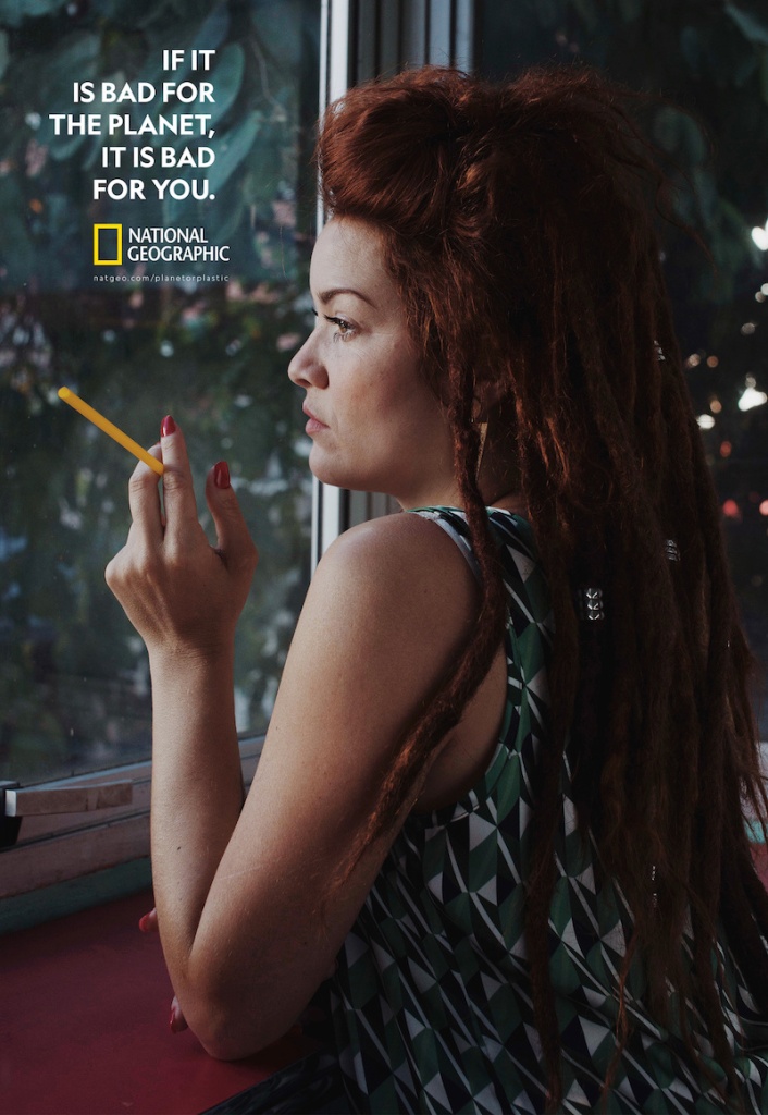
This campaign by National Geographic draws such an interesting parallel between the use of straws and smoking cigarettes. For many years now, cigarettes have been acknowledged as harmful and showing plastic straws in the same way creates an entirely new context in which to look at them.

Very clever!

Kate Peters – Photography

This incredible project by Kate Peters, photographer, and Gem Fletcher, art director, is a true labour of love. Interestingly too, this project, Imilchil is in fact all about love. Imilchil is a small town in Morocco’s Atlas mountains where once a year the local people congregate to find a partner. There are intricate rules about clothing and conduct and despite centuries old tradition, love can still find a way under these conditions.

You can see more of Kate Peters’ work on her website here.

And you can see more of Gem Fletcher’s work on her website here.