Monthly Archives: April 2016

Loch Ness Brewery – Packaging

Craft beer as a category provides such an interesting microcosm of design thinking. Whereas traditional beers have consistently appealed to heritage and seriousness in their design (mostly) craft beer, as an upstart going up against ‘Big Beer’, has always had the space to be more playful and experimental – not only with flavours and beer types but also with design.

We’ve shared a number of craft beer package designs on the blog as they provide such a great snapshot of where design is right now. Whether it’s heavily illustrated and incredibly intricate, simplified and modern or just wacky – there is a space for it in the craft beer design category.

So when you get a brand called ‘Loch Ness Brewery‘, what do you do? Do you jump straight to the Loch Ness Monster and try create a character? Do you look for images of the Loch itself and go from there? This work by Thirst, a design agency that specialises in craft drinks, takes a minimalist approach along with a smart naming convention to bring the brand to life. We always say that the best designs are those you would love to steal and keep for yourself and these fun, colourful labels are both entirely of the craft beer industry and also fresh enough that they stand out. We’d happily steal them (or rather… keep the bottles after we’d had a few!)

Here’s to finding Nessie!

Record Store Day Posters

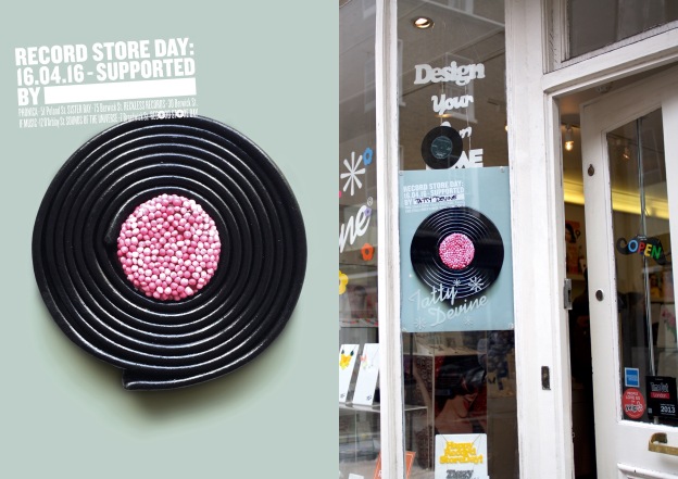
What a fun idea for Record Store Day by JWT London! A number of different posters were printed and handed out to local businesses in Soho. These businesses could choose a poster that best represented their product offering, and put one up in their window to show support for Record Store Day and direct people to their closest record store.

What is really smart though is how JWT managed to find interesting images and illustrations that apply both to the business themselves as well as Record Store Day, by finding things that look like records. From sweets, to a fat man trying to tie his belt – there are a number of ways records have been brought into these posters.

If we consider the disciplines we teach at The Academy, this campaign is such a perfect example of how art direction, design and illustration can work together within a single campaign to bring it home and really make something striking.

So let’s get out there and buy some records!

Alcoholics Anonymous New Zealand

This series of executions for Alcoholics Anonymous by Ogilvy and Mather Auckland tell a really meaningful story through a great concept and perfect consideration of illustration to bring the art direction to life. With the payoff line ‘Get Back’, these executions show how drinking and alcoholism can get in the way of the important things in your life. What truly sets these apart though, is the consideration paid to the art direction.

Rather than using photography or colourful illustration, these ads use soft watercolours to bring the illustration to life and add a sense of drama and sadness to the executions that could not have been conveyed otherwise. This shows a great understanding of art direction by the Art Director, who would have most probably commissioned an illustrator to bring their vision to life. People often ask how art direction can make a difference, and these are a perfect example.

Great stuff!


Red Bull Beat Battle Invite

We love this work by TWO.AM for Red Bull in South Africa. You need to watch the video below to truly appreciate it, but let us fill you in: holograms, people! We’ve got holograms!

This piece of direct communication served as an invite to the teams for the Red Bull Beat Battle (a breakdancing competition held annually in Jo’burg) and by using their phones, the crews who were invited got to see a real life hologram inviting them to the event.

Check it out below!

Bernardo Henning Illustration

Bernardo Henning is an Argentinian illustrator and artist with a busy, energetic style that we can’t get enough of. We love the mish-mash of colour, objects and illustrations all within a unified whole that presents a larger image or consideration for the design of the entire piece.

Henning’s work is such a great example of how illustration and design work together to create something that is much greater than the sum of its parts!

More work like this please!

Kyle Weeks – Palm Wine Collectors from Namibia

Kyle Weeks is an ex-student of the Academy and we are so excited watching his career blossom as he spends time in his home country of Namibia, documenting everything through his lens.

We’ve included some of his images here where he shot portraits of palm wine collectors in Namibia to show you what he’s been up to. So well composed and bringing to life the lushness of the palms – beautiful!

We also suggest you check out this link here at Atlas, a photography site, where Kyle gave a great interview as to his process and motivations for his work in Namibia.

Kent Andreasen – Photography

Kent Andreasen is a Cape Town based photography who has recently shot an abandoned mining town called Kleinzee for Vice Magazine.

What an amazing opportunity to get into a place that was unaccessible to the public for ages and to take some photographs. Check out the photos below, but do click on the link above to check out the full article – there’s a great writeup about the town and what the locals are trying to do to reinvigorate it.

Great work!

Justin Hogan Photography

Justin Hogan is a young photographer specialising in street photography and portraiture. We just love his powerful visuals depicting some of the icons of the music, art and entertainment industries.

His appreciation for making his subjects the absolute focal point of his portraiture is plain to see and makes for arresting imagery that is hard to ignore.

Bobby Doherty Photography

Bobby Doherty is a young photographer based in Brooklyn, New York. His appreciation for objects and patterns is what drew us to his work.

By repeating things or arranging them in specific ways, Doherty is able to take mundane objects we see every day and somehow render them more important, purely because of the way he treats them in his photography.

Masterful work and a beautiful eye!

Greer Muldowney Photography

Greer Muldowney is a photographer, curator and photography professor based in Boston. We were drawn to her work by a golden thread that finds its way through much of her imagery – the use of space in her compositions. Whether she is shooting an entire building in an architectural shot, a wind turbine in the distance or someone’s garden there is an appreciation of space and place that is undeniable.

Check out more of her work below!