Adrian Bauer, an illustrator from Germany, created these stunning illustrations of South American animals.
You can see more of his work on his website here.


Adrian Bauer, an illustrator from Germany, created these stunning illustrations of South American animals.
You can see more of his work on his website here.

Clean Mabel is a new cleaning product company, with incredible design by Sofia Noceti. We especially love the way they’ve shot the products for their marketing collateral too – such great art direction.


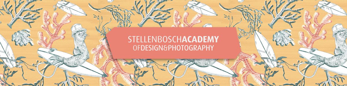
As part of the MCC label competition our 3rd year Graphic Design students created their own fictional wine farm, focusing on an interesting backstory. This formed the backbone of their conceptual thinking and had to be reflected in the logo as well as mood and tone throughout.
The students had the choice to design either for an Icon, Premium or an entry level wine and could choose between 3 wine labels for 3 different variants, or one wine label accompanied by packaging.
The concept and target market were the driving forces behind the shape of the labels, paper and colour choice, format, the packaging and the tone of voice.

We are elated to announce that out of the six finalists we had in the competition, two of our students received special mentions from the judges, and one of our students won the overall Gold Award (1st Place) for her label design.
Kahleah du Toit: Gold Award
Design: Pescador

The design solution was to create wine labels for a fictional wine farm called Pescador, which means ‘fisherman’ in Spanish. Pablo, an old Spanish fisherman, started it. He started making wine to pair with the fish he caught. Each wine is paired with a different type of fish, which inspired by the main tactile design element on every bottle. The rope used on the bottle top and carrier bag is symbolic of a fisherman’s net.
Klara Appelgryn: Special Mention
Design: Los Lappie

An Afrikaans-speaking woman from South Africa, Klara Appelgryn, established Loslappie in 2021. She aims to redefine the negative connotation around the Afrikaans term, “loslappie”, through wine with anti-spiking labels. For women, by woman.
Alice Botha: Special Mention
Design: Sloshed

“Sloshed” is a wine that has been created with inspiration drawn from the students of Stellenbosch.
The wine grants students an accessible experience of higher quality wine at a lower cost. An opportunity of a further cultural exploration of Stellenbosch is prompted while still appealing to their current lifestyle, experiences, and interests.
Debra Rowbotham: Finalist
Design: Rowboat

My fictional brand is Rowboat Estate, a wine farm located in Roberston and built around an abandoned rowboat found in the middle of a field. The label displays a wooden texture representing the story of the boat while the label is also painted with gold, speaking to the value of the product (treasure).
The experience of the wine is meant to resemble the feeling of finding a treasure in an abandoned wreck.
Luchelle Phillips: Finalist
Design: Eros

This project is based on a fictional story about a wine farm named in honour of the god of love, Eros, who in his quest to win over the heart of a moral, Psyche, turned to the hills of Italy where the best wine of the time was produced. Eros recruited the vintners of Montalcino to craft the finest blend to win over the heart of Psyche. When he realised that no wine prepared with mere human ability would achieve this he sent an asteroid down to barren fields deeply etched in the crevasses of the rolling hills of Montalcino to enrich the soil with nutrients that to this day produce the most sought after wines.
Nastasia Pestana: Finalist
Design: Ancienne

One sip of Ancienne’s flavourful wine will ultimately transport you to the magnificent Stellenbosch mountain backdrops, refreshing morning breeze, fertile soils, gentle rains, and plenty of sunshine year-round. Here is where we produce our signature wines that leave a taste of the land on your palette. Ancienne Wine undergoes an ecological and ethical approach to farming in order to keep our grapes healthy and the vineyards more sustainable. At Ancienne, we consider the entire vineyard as a whole. We recognize that there is an interconnection between all living things on the Ancienne farm. Our vineyards are grounded and connected to the earth as we follow a self-sustaining system. Our wine is the reflection of the farm, its workers, its winemakers, and you.

Dan Gartman, originally from Ukraine but now working in Warsaw, Poland, has a multitude of styles under his belt, all delivered with his signature flair.
We’ve shared a selection of images from across a number of his recent projects, so you can see just how versatile he is.
To see more of his work, check out his website here.


Brazilian illustrator Bárbara Tamilin did this gorgeous botanical inspired illustrations for Grupo Primavera campaign. Such lovely work!
Check out their website here.


EMANS, an illustrator based in Rome, has a bold high-energy style that we just can’t get enough of.
Check their work on out on their website here.


This beauty shoot by Margaret Karpenko is top notch! Such great portraits of the models, with a focus on the beauty products in question. Lovely!


Warsaw based photographer, Katarzyna Mrożewska, shot these stunning images of flowers called Fantome. We love the way she’s captured their fragility and beauty.
To see more of her work, follow her on Behance here.


We’re sharing a selection of images today shot by Dimitar Karanikolov from his series, Expired Architecture, which sees him shooting old abandoned buildings and monuments.
Such an incredible collection of images!


This Australian gin brand, Beyond Distilling, had Jo Cutri Studio create their stunning bottle design for their gin range.
In a category where there is a strong idea of what gin packaging ‘should’ look like, it’s a real breath of fresh air to see something so different. We love it!


