Monthly Archives: June 2020

Nasojet – Print Campaign

It’s not often that you’re tasked to make food like unappealing as an art director, but this campaign by McCann Health Sao Paulo does just that. To advertise Nasojet nose spray, they created this work based on the benefit that when your nose is blocked you can’t taste anything properly. And thanks to some really great art direction, they managed to make all of this food look not tasty at all.

This is such a great example of how a strong benefit can help you crack a really fun concept for a campaign.

New York State – Covid-19 Public Communication Campaign

Usually when you see public service communication, you expect it to look and feel a certain way. Especially when its about something as serious as Covid-19, you might expect sober, clinical looking communication. But the problem is that very often that can end up being wallpaper. Because we as consumers know what that kind of messaging looks and feels like, it can be easy to not pay attention.
That’s exactly why we love this work by TBWA\Chiat\Day for New York State. By being colourful, hand-drawn and high energy it cuts right through the clutter and makes people pay attention.

Canon – First Hugs

It’s interesting to think that we’ve been sharing advertising and communications campaigns about Covid-19 (we’re sharing another later this week), when the next part to communicate about will be the easing of lockdowns across the globe.

This work by Happiness Belgium for Canon documents the first hugs people were able to have after lockdown measures were eased in the country. And we have to admit – we love it! This is such a great way to show the power of photography for a brand like Canon, while capturing a really important cultural moment.

Let’s see how other brands deal with lockdown easing – it’s going to be fascinating!

Goolygooly Studio – Illustration

Based in South Korea, Goolygooly Studio is the brainchild of Kim Hyun. He is an illustrator who uses the innocence and joy of youth as inspiration for all of his work. Here, we’re sharing a selection of illustrations he did for a calendar, which was limited to 600 prints in total.

We love the character design in this work and that little penguin is just perfect!

You can see more of Goolygooly Studio’s work on their Behance page here.

Or on their instagram page here.

Yuko Higuchi x Gucci – Illustration

To celebrate the launch of their new collaborative kids and baby’s collection, Gucci and Yuko Higuchi created an online game where kids can play a puzzle game with the illustrations used in the collection. What a great way to bring multimedia, fashion and illustration together in one space. There’s even a downloadable colouring book!

You can check out the puzzle game here.

And to see more of Yuko Higuchi’s amazing illustrations, check out her website here.

Paulaner Rebrand – Design

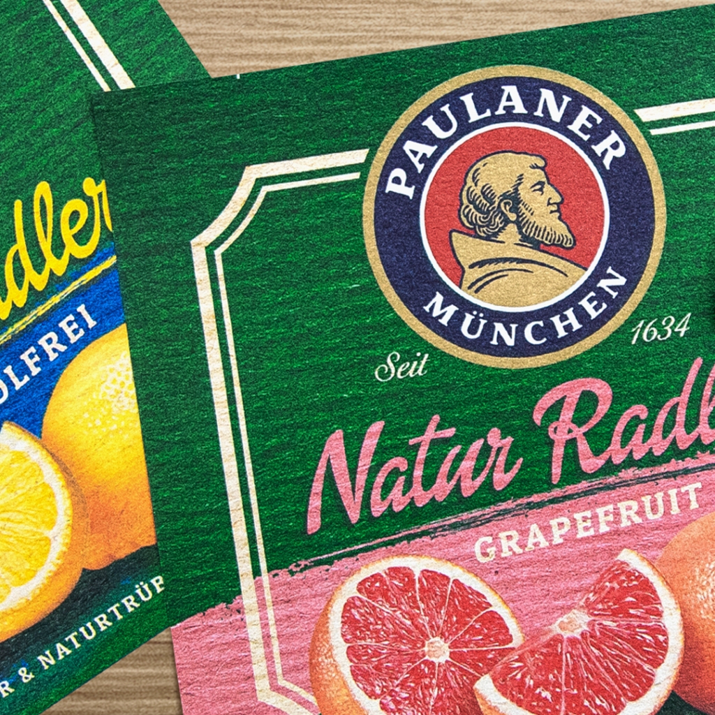
To rebrand a heritage powerhouse like the Paulaner in Munich is no easy task. There are so many things that are important to keep for the sake of brand equity, but at the same time it can’t stay the same forever. Especially when other brands are moving forward.

This work by Higgins Design gets the balance just right between keeping the things that are vital to the brand, while finding a new, modern way to bring it to life. So often the initial response as a creative is to want to start fresh but there is the very real risk of throwing the baby out with the bathwater. This is a perfect example of how you find that balance between old and new.

My Better Normal – Website

My Better Normal is a digital time capsule concept, designed by Locomotive, a Digital first design agency from Canada. The idea is quite simple – you can send yourself a totally private time capsule message, which will be sent to you 1 October 2021. Not only do we love the concept, but we love the sound design on the site. Using the flashing cursor of a digital clock, the site itself emits a ticking sound – reminding you of the passing of time. Such a small detail, but such an important one!

You can visit the site here.

Albert Carruesco – Character Design

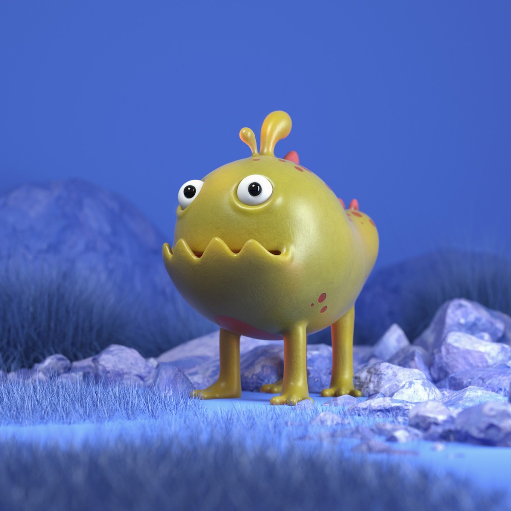
We love this work by Spanish 3D designer, Albert Carruesco. This series of characters is called ‘More and More Stupid Friends V3’ and we can’t help but smile at the name he’s given them. We love the character design, the personality he’s captured in each character and the skills he’s used to render them so beautifully in 3D.

You can see more of his work on his Behance profile here.

Or his website here.

Daniel Bergeron and Jeff Whitlock – Photography and Retouching

This series of images, photographed by Daniel Bergeron and retouched by Jeff Whitlock shows some beautiful portraits of famous musicians. We love the way they have captured the essence of these people we feel we know so well, but in fact we don’t know at all. Whether it’s Flea, Nick Cave, Common, Pharrell or Henry Rollins – there’s someone here for everyone!

You can see more of Bergeron’s photography on his site here.

And you can see more of Whitlock’s retouching here.

Nike – For Once, Don’t Do It

Many brands have spoken out about the racial injustice and police brutality we’ve seen in America (and across the world) and many have done really amazing work. Today, we’re sharing this one from Nike, which makes a really strong point purely from its restraint. Using nothing but a black background, text and a great track they make a really hard-hitting piece of communication.

And we agree. For Once, Don’t Do It.