Monthly Archives: October 2018

Red Road Project

This photography and documentary project by Carlotta Cardana and Danielle SeeWalker documents Native Americans living in America. With a mixture of landscapes, portraits and documentary photography, this series aims to highlight inspiring stories and images of Native American people through a mixture of photography and writing.

Not only are these images really beautiful, they serve a second function too – highlighting an often marginalised part of American society.

To learn more about the Red Road Project, take a look at their website here.

TicTac – Dia de los Muertos

It’s always a lot of fun to see brands take on seasonal changes in their design to offer something a little different or interesting to their consumers. This work by 121 does just that, in such a fun way.

In Mexico, the day of the dead or Dia de los Muertos is a celebration of those no longer with us, similar to Halloween, but with a very defined aesthetic. To celebrate that, 121 helped TicTac create a seasonal variant in Mexico, with skulls printed directly onto the TicTacs themselves. This ‘sugar skull’ design was also applied to the labelling on the packaging itself.

We love it!

Adamo – Packaging and Product Design

When we saw this project we just had to share it! Adamo is a Hungarian company that makes baby swings and hammocks for kids. They paired up with design studio Classmate Studio, who did the packaging for these products – creating an offering that is just incredible from start to finish.

The products themselves are beautifully designed and considered and the packaging is absolutely top notch. Who said design for babies and children couldn’t be innocent, fun and considered all at the same time?

SalzburgMilch – Print Campaign

We love this campaign by Traktor Wien for SalzburgMilch, a dairy producer in Austria. They built the idea of a very simple idea, which translated means: Cheese is art. Using bread, cheese and other sandwich ingredients – they created miniature, edible versions of famous paintings.

Perfect!

As they say – Käse ist Kunst.


Spicy No Spicy – Website

Creating a really great website for a restaurant has become somewhat of an art these days. We really appreciate what The First The Last have done here for Ukrainian restaurant, Spicy No Spicy. The restaurant itself has a very well considered interior design and one can immediately see the logic in having a website to match.

Great illustration, beautiful use of colour and a really nice cursor (who would have thought that would be something to mention!) make this site a really great example of a functional site that does its job incredibly well, while also being a joy to use and look at.

To see more of the site, click here.

Screenshot 2018-10-12 at 13.34.17.png

Screenshot 2018-10-12 at 13.32.40.png

Alena Gelen wins Adobe Design Achievement Award

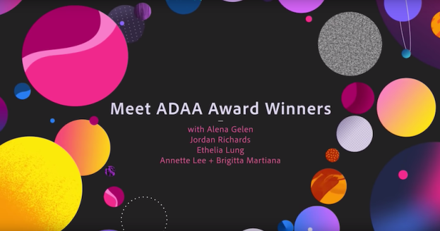
As you may be aware, one of our students, Alena Gelen, was named as a winner in the Adobe Design Achievement Awards 2018. In this video, she was interviewed live on YouTube about herself and her achievements – no pressure!

To learn more about her achievement, please click here.

Toyota Corolla – TV Ads

We love this campaign by Saatchi & Saatchi LA for Toyota. It uses the idea that some things are just timeless and relates this to the Toyota Corolla itself, with some really great thinking, copywriting and art direction all rolled into one package.

These three executions also give a great example of how a good idea can be fleshed out into a larger campaign, with other executions playing off the same original idea.

Brilliant!