Monthly Archives: July 2020

Christian Kneise – Photography

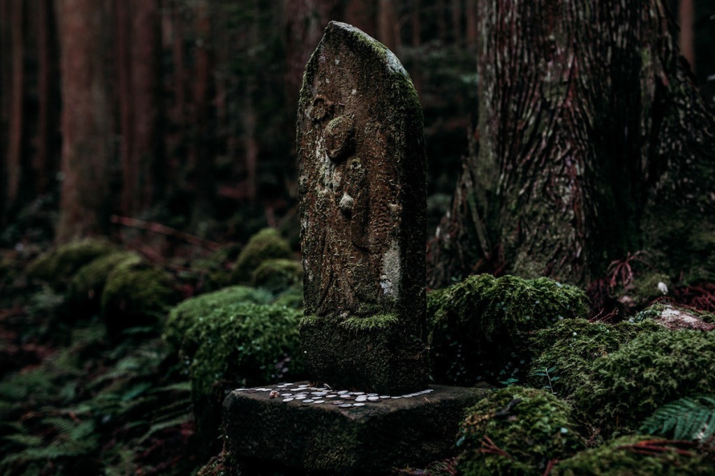
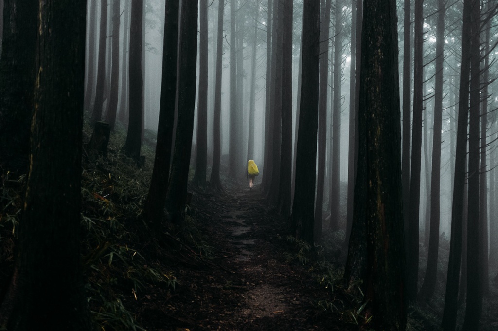
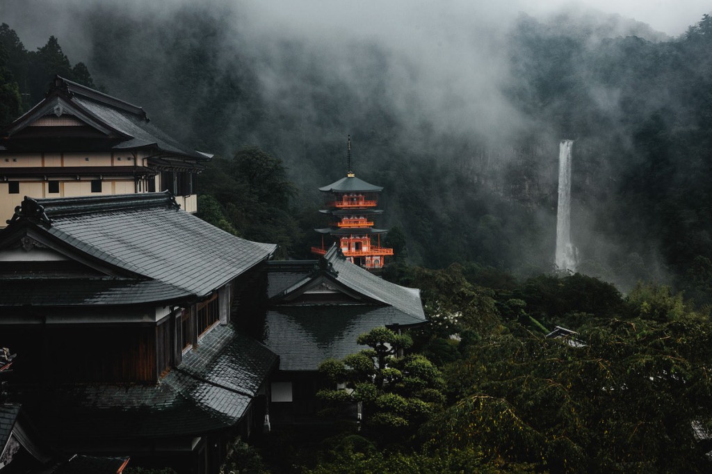
We’ve selected some images from Christian Kneise’s series Sacred Path, which documents an ancient pilgrimage route in Japan. The sense of place, mood and contemplation is so beautifully captured in these pictures; we feel as if we’re really there.

To see more of Kneise’s work you can check out his Behance profile here.

Or you can visit his website here.

Patrick Heng – Multimedia

Patrick Heng is a creative developer based in Paris who is a specialist in multimedia design. He has a specific interest in WebGL and UI animations, which you can see put to use on his amazing personal site. From the way the design works and how motion adds to it – this is a great example of the very forefront of web design right now.

You can visit his site here.

Anna Vorontsova – Illustration

Anna Vorontsova is a Moscow-based freelance illustrator with a really loose style that we can’t get enough of. Today, we’re sharing some of her work from her series Drawing Breakfast, where she does exactly what the name of the series is.

Every Friday, she and a bunch of her friends and colleagues have breakfast in cafes in Moscow and draw the people and places they find themselves in. We love it!

To see more of her work, you can check out her Behance profile here.

Nadiia Doicheva – Illustration

Nadiia Doicheva is an illustrator from Ukraine who mixes traditional art techniques with computer graphics to make beautiful finished artwork.

Today we’re sharing some selections from her series called Fishes, which as you might expect – features some lovely images of fish.

You can see more of her work on her Behance profile here.

Meier’s Creek – Packaging

This is some top shelf brand development by Thirst, a design agency specialising in drinks packaging and branding. They were approached by Meier’s Creek Brewing for a branding job and they took inspiration from the look and feel of the US National Parks. Hence we see some gorgeous patches, which began as a logo for the brewery itself and then also became identifiers for all of the beer types too.

Their goal was to set up the brewery itself as a destination to visit, which we feel they’ve done perfectly here. We love this project so much!

Samsung – Print Campaign

This is a really smart campaign by Leo Burnett Frankfurt for Samsung. To show how Samsung’s new range of TVs cut down on reflections on their screen, they used some clever art direction to show just how a reflection on your TV Screen can affect your viewing.

Simple, hard-hitting and strong visuals. Just the way we like our print advertising!

Destalo Wine – Packaging

It’s always interesting to see wine packaging that breaks from tradition. This work by Bisarro Studio for Portuguese brand, Destalo, uses illustration to create a strong brand that stands out from the crowd.

Taking inspiration from endangered species from where the wines are produced, we see an illustrated otter, royal duck and tortoise on the white, rosé and red wines respectively. Such a great idea. And at the same time, it reminds the viewer of the terroir of the wine itself. Clever!

You can see more shots of the packaging below.

Peckish – Packaging

We don’t always think of boiled eggs as convenience food. But they really are pretty convenient and good ‘on the go’ food when you think about it.

Sonoma Brands decided to bring this to life and create a new brand in the ‘grab and go’ category and turned to Hatch (a San Francisco based agency with a name that seems quite fitting) for the branding.

We must say, they’ve done an absolutely incredible job. this brand is so well thought out, beautifully executed and brought to life through some gorgeous illustration.

Superfluid – Website

This website by Numbered, for Netherlands based cosmetic company Superfluid is such a great example of modern web design. From the way the site uses photography (beautifully) to the use of typography and motion, this is absolutely top drawer work.

One of our favourite details on this site is how a photograph appears behind the product on mouseover – such a great thought. It makes the shop page so much more engaging as a user. You’ll have to see it for yourself!

You can visit Superfluid’s site here.

Sankar Sridhar – Photography

Sankar Sridhar is a freelance photographer and travel writer from New Dehli. Today, we’re sharing his series of images called Diversity, thou art India, which shows the various cultures, people and ways of living in India.

As a medium which can transport to you to an entirely different place, is there anything better than photography? There’s so much to learn and take in, just through these images! This project is not only fascinating but it’s also beautifully shot. Amazing!

To see more of Sankar Sridhar’s work you can see his website here.

Or you can check him out on Behance here.